
Why Your Website Content and Design Must Work Together
Website content and design must work together to create a clear, engaging, and conversion-focused experience for visitors.
Many businesses focus heavily on colors, images, animations, and layouts but forget about the words placed on the page. Others write detailed content but present it in a way that looks crowded and difficult to read.
The best websites combine strong design with clear content. When both work together, visitors understand the business faster, trust the brand, and are more likely to take action.
Businesses planning a new website or improving an existing one can benefit from working with an experienced website design agency that understands how content and layout should support each other.
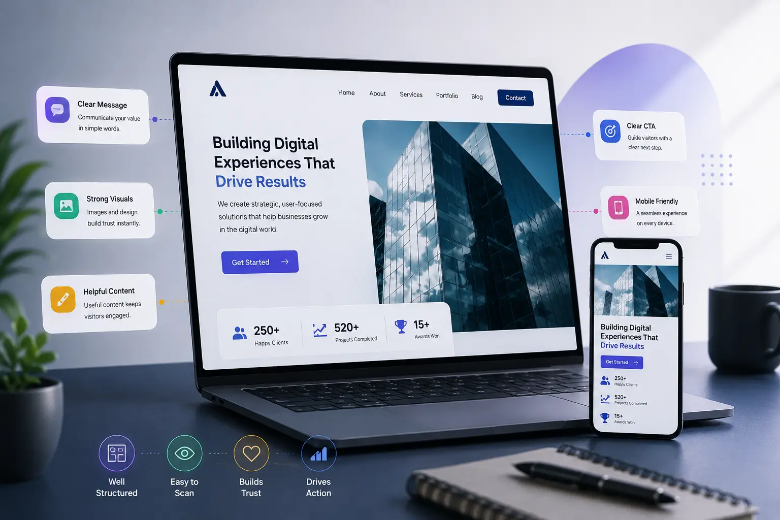
Design Gets Attention, Content Gives Meaning
Website design creates the first impression.
Colors, images, spacing, and layout help visitors decide whether the website looks professional. However, design alone cannot explain what the business offers.
Content gives meaning to the design.
A strong headline tells visitors what the business does. A short paragraph explains the main benefit. A clear button tells users what they should do next.
Without useful content, even a beautiful website may feel empty or confusing.
Clear Content Helps Visitors Understand the Business
People visit a website because they want information.
They may want to know:
- What the business offers
- How the service works
- How much it costs
- Why they should choose the company
- How they can contact the team
The content should answer these questions in simple language.
Complicated words, long paragraphs, and unclear explanations can make visitors lose interest. Content should sound natural and be easy to understand.
A visitor should not need to read several pages to understand the main offer.
Good Design Makes Content Easier to Read
Even valuable content can fail if it is difficult to read.
Large blocks of text make a page look heavy. Small fonts, poor spacing, and weak contrast can make reading uncomfortable.
Good design breaks content into clear sections using:
- Headings
- Short paragraphs
- Bullet points
- Images
- Icons
- White space
- Highlighted information
This helps visitors scan the page and find the information they need.
Most people do not read every line on a website. They usually scan headings first and then focus on sections that interest them.
Professional web design services can help organise content in a way that looks attractive while remaining easy to read and navigate.
Headlines Should Be Clear and Useful
Headlines are one of the most important parts of website content.
A good headline should immediately tell visitors what the page is about.
For example, a headline such as “Build a Better Future” may sound attractive, but it does not explain the service clearly.
A more useful headline could be:
“Custom Website Design for Small Businesses”
This headline tells visitors exactly what the business offers and who the service is for.
Creative headlines can still be used, but clarity should always come first.
Content Should Guide the User
Every page should have a clear purpose.
A service page may guide visitors towards booking a consultation. A product page may encourage them to make a purchase. A blog post may help them learn more and explore another page.
The content should support this journey.
For example, a service page can follow this order:
- Explain the main service
- Show how it helps the customer
- Describe the process
- Add reviews or examples
- Include a clear call to action
This structure gives visitors the information they need before asking them to take the next step.
Design Should Highlight Important Information
Not every sentence on a page has the same importance.
The design should make key information stand out.
Important details may include:
- Main benefits
- Special features
- Prices
- Customer results
- Contact buttons
- Important policies
Designers can use larger text, bold headings, cards, icons, or contrast to highlight these details.
However, highlighting too many elements can create confusion. If everything looks important, nothing truly stands out.
Images Should Support the Content
Images should have a clear purpose.
A product image should show the item properly. A service page image should help explain the work. A team photograph can make the business feel more personal.
Random stock images may look professional, but they do not always add value.
The image should support the message written on the page.
For example, a web design company can use screenshots from its website design portfolio instead of generic office images.
Real and relevant visuals usually feel more trustworthy.
Calls to Action Need Clear Wording
A call to action tells visitors what to do next.
Examples include:
- Request a Quote
- Book a Consultation
- View Our Services
- Start Your Project
- Contact Our Team
The button text should match the content around it.
If the page explains a service, the button can invite the visitor to request more information. If the page describes a product, the button can guide the user towards purchasing it.
Vague buttons such as “Click Here” do not provide enough information.
Clear wording makes the next step easier to understand.
View Innovative Agency Canada on Google Maps for location details and customer reviews.
Content Should Match the Brand Voice
The language used on a website should match the personality of the business.
A law firm may use a professional and confident tone. A children’s brand may use friendly and playful language. A technology company may use simple and modern wording.
The tone should remain consistent across all pages.
If the homepage sounds formal but the service pages sound too casual, the website may feel disconnected.
Consistency helps build a stronger brand identity.
Mobile Content Should Be Easy to Scan
Mobile users often read content on smaller screens and may have less time.
Long paragraphs and crowded layouts can make the experience difficult.
Mobile-friendly content should include:
- Short paragraphs
- Clear headings
- Large readable text
- Enough spacing
- Simple buttons
- Important information near the top
Businesses should review their website content on mobile devices, not only on desktop screens.
A page that looks good on a computer may still feel difficult to read on a phone.
Professional mobile website design helps content remain clear, readable, and easy to navigate across different screen sizes.
Common Content and Design Mistakes
Some websites have strong content but poor presentation. Others look impressive but do not provide enough useful information.
Common mistakes include:
- Long paragraphs without headings
- Too many design effects
- Weak headlines
- Unclear service descriptions
- Buttons with vague text
- Low-quality images
- Important information placed too far down
- Different writing styles on different pages
These issues can make the website harder to understand.
How to Improve Website Content and Design Together
Businesses should review each website page from the visitor’s point of view.
They can ask:
- Is the main message clear?
- Can visitors understand the service quickly?
- Is the content easy to scan?
- Do the images support the message?
- Is the call to action visible?
- Does the page look good on mobile?
- Is any information repeated unnecessarily?
Designers and content writers should work together instead of completing their work separately.
This helps ensure that the layout supports the message and the content fits the design.
Final Thoughts
A successful website needs both strong design and useful content.
Design attracts attention, while content helps visitors understand, trust, and take action.
When the layout is clear, the text is easy to read, and the message is relevant, the website becomes more effective.
Businesses should not treat content and design as separate parts. They should work together to create a smooth and helpful experience for every visitor.
Businesses that need help aligning their content, layout, and conversion goals can request a free website consultation.
🍁 Get updates
Join Our Web Design Insights Community


4689 weekly subscribe
Subscribe to receive practical website design insights, website best practices, and updates that help businesses improve their online presence. No spam—just useful information you can actually apply.