
7 Psychology of Web Design Principles That Influence Buying Decisions
Web design psychology explains how colors, layout, trust signals, and visual structure influence how visitors feel and act on a website.
A website is not only about good looks. Its design can influence how visitors feel, what they notice, and whether they trust the business enough to take action.When someone visits a website, they quickly decide whether it looks professional, useful, and reliable. Colors, images, spacing, buttons, reviews, and page structure all play an important role in that decision.
A well-designed website makes visitors feel comfortable. It helps them find information easily and guides them towards actions such as buying a product, booking a service, or contacting the business.
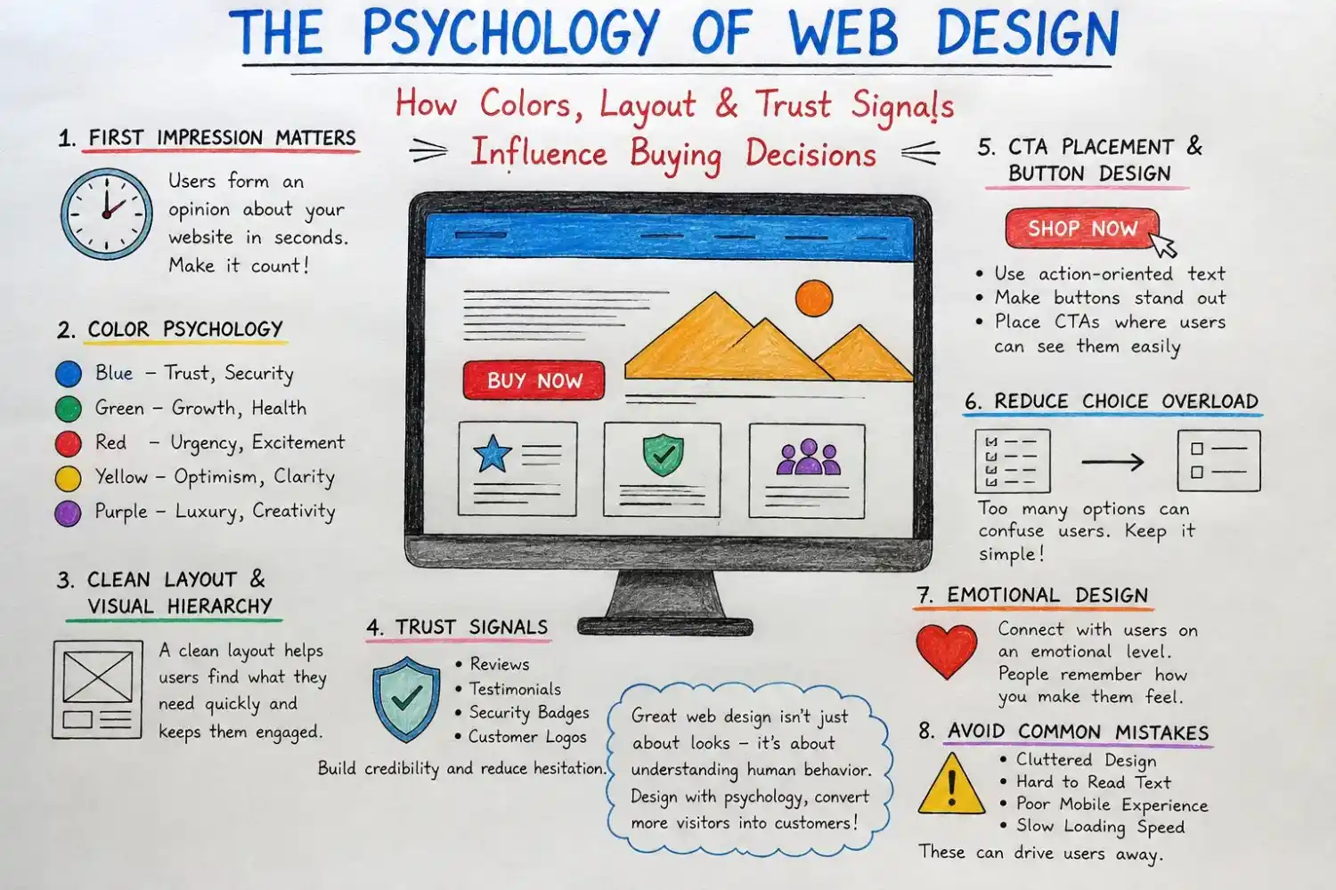
How Colors Affect Users
- Colors can influence emotions and help communicate a brand’s personality.
- There is no single color that guarantees more sales. The important thing is to choose colors that match the business and create enough contrast.
- Blue is often connected with trust, security, and professionalism. This is why many banks, technology companies, and service businesses use it.
- Green is linked with health, growth, nature, and freshness. It works well for wellness, environmental, and financial brands.
- Red creates excitement and urgency. It is often used for sale messages and important buttons, but too much red can make a website feel aggressive.
- Yellow feels positive, friendly, and energetic. Purple can represent creativity and luxury, while black is often used for premium and modern brands.
For example, a call-to-action button should stand out clearly from the background.
A professional website design strategy uses contrast and brand colors to guide attention without overwhelming users.
A Clean Layout Makes Decisions Easier
Visitors do not always read every word on a page. Most people scan headings, images, buttons, and short paragraphs.
A clean layout helps users quickly understand what is important.
Websites should use:
- Clear headings
- Short paragraphs
- Enough white space
- Easy navigation
- Visible buttons
- Relevant images
When too many elements appear on the same page, users may feel confused. This can make it harder for them to choose a product or complete an action.
A simple design does not mean a boring design. It means removing unnecessary distractions.
Visual Hierarchy Guides Attention
Visual hierarchy controls what users notice first.
Large headings attract attention before small text. Bright buttons stand out more than simple links. Images can also direct users towards important information.
A page should guide visitors in a natural order:
- Main headline
- Key benefit
- Product or service information
- Customer reviews
- Call-to-action button
When everything looks equally important, visitors may not know where to focus.
Trust Signals Reduce Customer Doubts
People are often careful when buying online, especially from a business they have never used before.
Trust signals help visitors feel more confident.
Useful trust signals include:
- Customer reviews
- Testimonials
- Case studies
- Security badges
- Clear contact information
- Return and refund policies
- Client logos
- Real business photographs
Reviews are especially powerful because they show that other customers have already used the product or service.
However, reviews should feel genuine. Detailed testimonials with real names or business information usually look more trustworthy than short and general statements.
Understanding the need of website design services which help you stay competitive and avoid losing potential customers.
Clear policies also matter. Visitors are more likely to buy when they understand shipping, returns, refunds, and payment security.
Calls to Action Should Be Clear
A call to action tells visitors what to do next.
Examples include:
- Book a Consultation
- Request a Quote
- Buy Now
- Add to Cart
- Contact Our Team
- Start Your Free Trial
Buttons such as “Click Here” or “Submit” are less effective because they do not clearly explain what will happen.
The button should be easy to notice and placed near useful information.
For example, a “Book a Consultation” button can appear after the business explains its services and shows customer testimonials.
Businesses should also avoid using too many different buttons on the same page. One clear main action is easier to understand.
Website Speed Also Affects Trust
A slow website can frustrate visitors and make the business look unreliable.
People expect pages to load quickly, especially on mobile devices. If a website takes too long, they may leave and visit a competitor.
Large images, unnecessary animations, too many plugins, and poor hosting can slow down a website.
Improving speed makes the experience smoother and can also help more visitors complete purchases or contact forms.
Strong website development helps improve page speed, functionality, and overall user experience.
Images Create Emotional Connections
Images help users understand products and services quickly.
Businesses can also use examples from their website design portfolio to build credibility.
Original photographs of the team, workplace, projects, or products usually feel more authentic than common stock images.
For an online store, product images should show different angles and details. Service businesses can use before-and-after pictures, completed projects, or screenshots of their work.
Images should support the content. They should not only be added to fill empty space.
Mobile Design Is Essential
Many visitors browse websites from their phones. A website that works well on desktop but poorly on mobile can lose customers.
A mobile-friendly website should have:
- Readable text
- Large buttons
- Simple menus
- Short forms
- Fast-loading pages
- Clickable phone numbers
- Easy checkout
Users should not need to zoom in or scroll sideways to read the content.
Professional mobile website design keeps content, buttons, and navigation easy to use on smaller screens.
Mobile design should make important actions quick and convenient.
Common Web Design Mistakes
Some design mistakes can reduce trust and sales.
These include:
- Too much text on one page
- Small or difficult-to-read fonts
- Poor color contrast
- Too many pop-ups
- Hidden contact details
- Complicated forms
- Unclear buttons
- Fake countdown timers
- Unexpected costs during checkout
These problems make visitors feel uncomfortable or confused.
The best websites keep the process simple and honest.
“Website Speed Also Affects Trust” section mein Google PageSpeed Insights ya Google Search Central ka link add karo.
How to Use Web Design Psychology Ethically
Web design psychology should improve the user experience, not trick people.
Businesses should avoid fake urgency, hidden charges, misleading buttons, and difficult cancellation processes.
These methods may produce short-term results, but they damage customer trust.
Good design gives visitors clear information and allows them to make confident decisions.
Final Thoughts
A successful website understands both design and human behaviour.
Colors create emotions. Layout guides attention. Reviews build trust. Clear buttons help users take action. Speed and mobile usability make the experience easier.
The goal is not to pressure visitors into buying. The goal is to remove confusion and help them feel confident.
When a website is clear, professional, and easy to use, visitors are more likely to stay longer, trust the business, and become customers.
Businesses that want a more persuasive and user-friendly website can request a free website consultation.
🍁 Get updates
Join Our Web Design Insights Community


4689 weekly subscribe
Subscribe to receive practical website design insights, website best practices, and updates that help businesses improve their online presence. No spam—just useful information you can actually apply.